
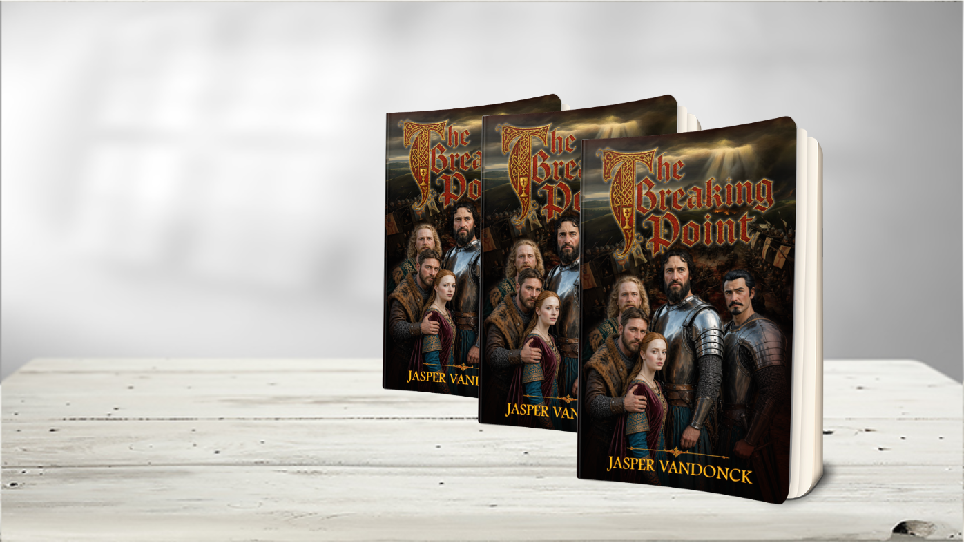
Project Overview
Title: The Breaking Point
Genre: Historical Fiction
Client: Jasper Vandonck
Release Goal: May 2026
A cinematic, character-driven cover designed to capture the emotional and political tension of the Hussite Wars – where loyalty, faith, and family collide.
The Brief
Jasper approached me with a strong narrative foundation but no visual direction beyond a core idea:
- Five main characters, each with conflicting loyalties
- A dramatic wartime setting (Hussite Wars, Bohemia)
- Emotional tension between brothers, duty, and love
- A battle scene in the background
- A composition that feels epic, historical, and grounded
The goal was clear:
Create a cover that feels like a high-budget historical drama – instantly immersive and emotionally charged.
Creative Direction
Instead of focusing purely on action, I chose to center the design around human tension.
Why?
Because readers of historical fiction don’t just buy battles.
They buy conflict between people.
Key decisions:
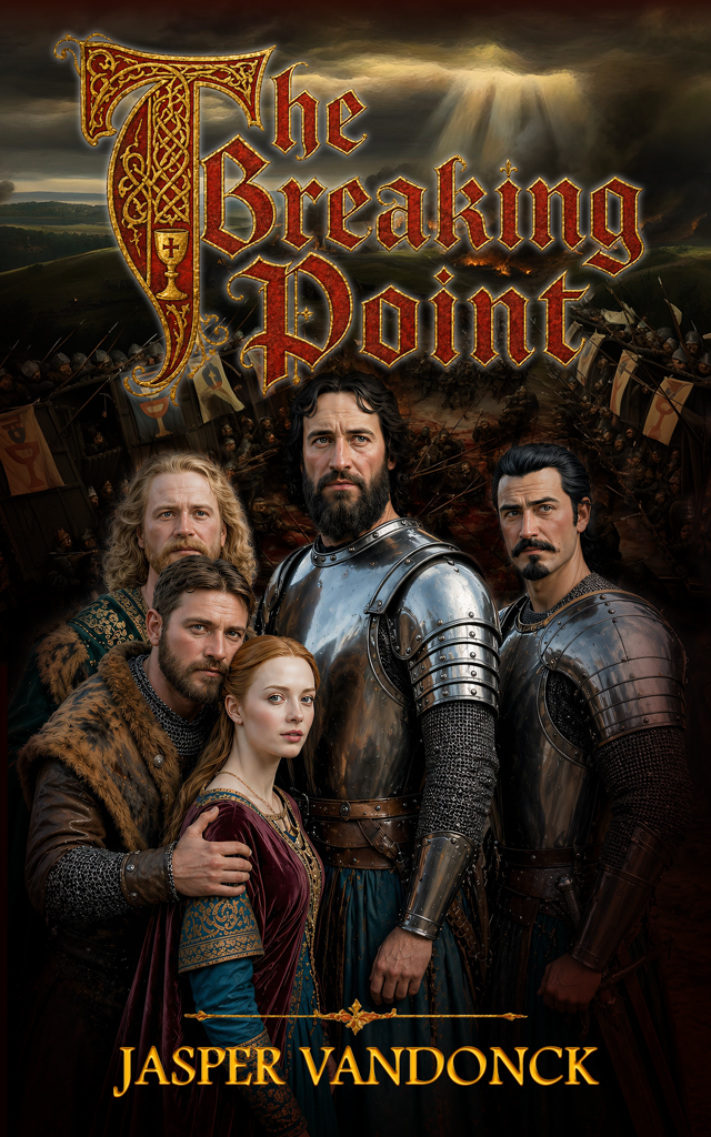
- Foreground dominance: The five characters take center stage, establishing emotional stakes immediately
- Layered storytelling: Each face hints at a different arc, alliance, or internal struggle
- Battle as context, not focus: The war unfolds behind them – looming, inevitable
- Lighting: Divine rays breaking through clouds – symbolic of fate, judgment, and turning points
Typography & Visual Identity
The title design plays a crucial role in selling the genre instantly.
- Medieval blackletter style → authenticity and historical grounding
- Ornate illuminated “T” → inspired by manuscript art from the era
- Gold + deep red palette → evokes power, blood, and royalty
- Subtle religious symbolism (chalice) → ties into the Hussite themes
This wasn’t just a title.
It’s a visual anchor that signals: this is serious historical fiction.
Character Composition
Each character was carefully positioned to reflect narrative dynamics:
- Sir Radovan (center): Authority, burden, moral conflict
- Jan & Jana (foreground left): Love vs duty tension
- Hynce (rear): Noble identity and ideological divide
- Thomas (right): Observer turned participant
The composition creates a subtle question in the viewer’s mind:
“Who stands with whom when everything breaks?”
What Makes This Cover Work
This design succeeds because it balances three critical elements:
1. Instant Genre Recognition
No confusion – this is historical fiction with depth and scale.
2. Emotional Hook
The relationships draw you in before the battle does.
3. Market Positioning
Feels comparable to premium titles (e.g., Kingdom Come Deliverance vibe), giving the book perceived value before it’s even opened.
Client Feedback
“I like this one very much. The background, the logo and character are greatly done. I see that there are no changes needed. Thank you for making such a nice cover!”
– Jasper Vandonck
No revisions.
That’s always a strong signal the concept hit exactly right.
Behind the Strategy
Most covers try to show everything.
This one focuses on what matters most:
👉 Conflict between people, not just armies
👉 Clarity over clutter
👉 Emotion over noise
Because at the end of the day,
readers don’t buy books – they buy feelings.
Thinking About Your Own Cover?
If your book:
- Has strong characters but no visual identity yet
- Risks blending into the crowd
- Needs a cover that actually sells, not just looks nice
Then we should talk.
I personally handle every concept and collaborate with a small trusted network when needed – so you get both attention to detail and scalability when deadlines matter.
→ Request a Quote
Tell me about your book, and I’ll come back with a concept direction tailored to your story.
No pressure. Just clarity.
